![]()
8 Effective tips to make your Presentations more converting!

Our professional roles often require that we present data and information so that we can make strategic decisions. To be effective, the presentation must communicate a story that persuades other people to take action. In telling the story, we must pay attention to how the presentation slides are designed and prepared because they are one of the main tools.
It is easy to make the mistake of creating slides that are nothing more than bullet points and large blocks of text when trying to present a lot of crucial information. The presentation should not be transcribed on your slides. If they do, you can cancel the face-to-face meeting and simply send the presentation deck to the expected attendees so they can read the slides at their convenience and get all the content they need.
Visual aids are an important part of your presentation; your slides should support this emphasis. When you don’t have your audience reading along with (or ahead of) you as you speak, they will be more able to focus on understanding what you are saying. Take advantage of the visual aids to tell your story and give an informative presentation rather than text-heavy slides.
Following are 8 helpful tips.
1. One slide – One idea!
Forget any rules that you may have heard regarding the number of slides in a presentation of a given length such as, “Don’t use more than one slide in a minute” and “Ten slides for a 20-minute presentation using 30-point font.”
Adding slides to the presentation deck isn’t a problem, because they are free. You should focus on creating slides that present one single idea. A single slide that presents three ideas will not save you any presenting time instead of a separate slide for each idea. As your slide count increases, your viewers will be much more focused on a single idea instead of juggling three ideas at once. Therefore, you will likely be more proficient at expressing those ideas and increasing your credibility.
2. Transform a bullet list into a graphic element.
If you have ever seen a presentation, you’ve probably heard that you shouldn’t have more than six bullet points in each slide. You would have to read your slides while you talk, and your audience can’t focus on what you say if they’re reading. A further disadvantage of this is that they will read faster than you can speak, so when you finish speaking what they have already read, they’ll have to wait while you finish saying it.
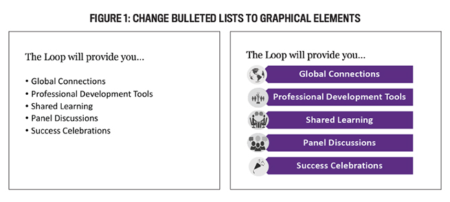
Figure 1 shows an example of how the text can be converted into graphical format. You can change bulleted lists into graphical displays in PowerPoint with Smart Art. The slide on the right has the same text as the bulleted list, but it is much more appealing. Your audience will not be able to read ahead by adding an animation to the slide so each point appears as you discuss it, helping them concentrate on that one particular point.
3. Plan your slides using original templates.
PowerPoint can be opened and a stock template can be selected easily. Eventually, everyone starts to recognize the template and it begins to be perceived as “old” or “tired.” By designing a custom template, you can capture your audience’s attention. You don’t need something fancy, just something different. A corporate-specific template may also be available from your company’s branding and marketing department.
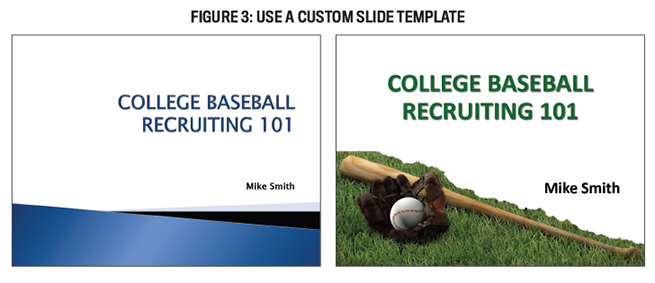
Figure 3 shows the slide titles. A generic template is displayed on the slide on the left. Nothing about it grabs the attention of the audience or generates interest. Although the right slide is based on a custom template for the presentation, it is not the main topic of the presentation. Each of the four slides can have a picture of the bat, ball, glove, and grass as well as a related picture or graphic element.
4. Change graph formats from default.
We accountants and finance people will probably need charts and figures in our presentations. Excel and other spreadsheet programs let you create nice graphs easily. They’re helpful for displaying data, but they require some adjustments in presentations to be effective. Highlight the most important parts of the graph.
As an example, take a look at slides 1 and 2 in Figure 4. A presentation audience member will not read all the data points in the left-hand slide. We removed unnecessary grid lines, slenderized other lines, and reformatted the data labels to make the slide on the right more appealing (if they do, they won’t be paying attention to what you say). Therefore, we have a much easier time reading the result.
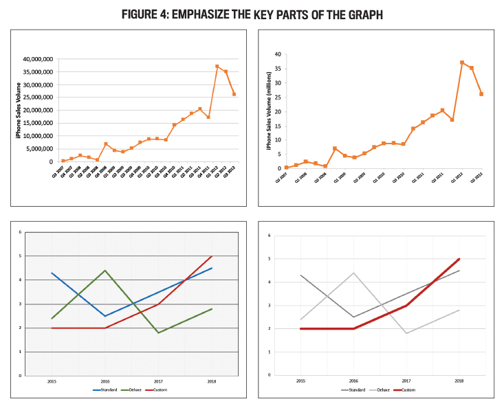
The chart is used to demonstrate the performance of the Custom line in the second set of slides. On the right-hand slide, a line immediately grabs your attention. A simple adjustment to the chart was to increase the line width and adjust the colors.
Do not use charts with 3D effects either. The data presented is distorted. On the left of Figure 5, you can see a 3D bar chart. Bar height is nearly impossible to determine. To determine the height of the bar, should you look in the front or back? Check out the 2014 Standard bar. It appears that the value is less than 4 in the 3D chart. Nevertheless, it’s clear that the value is greater than 4 when converted to a 2D chart.
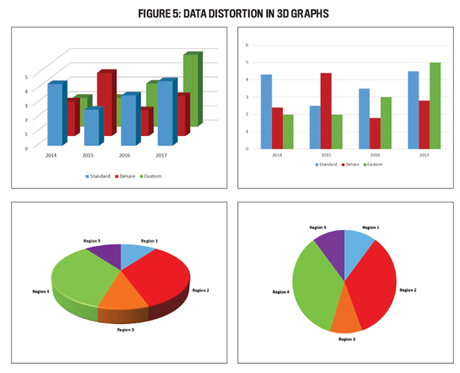
The same issue exists with pie charts. The second set of graphs in Figure 5 shows all three regions (10%) have the same value. On a 3D pie chart, however, Region 3 appears larger than Region 1 and Region 5.
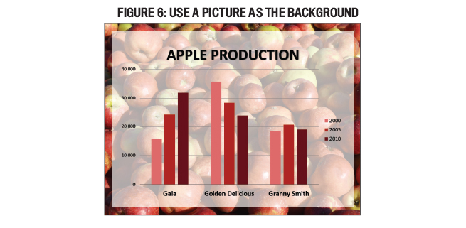
5. Set the background with pictures.
It is a fact that while the use of a plain white background may be appropriate in certain circumstances, it doesn’t exactly add to the visual appeal. As an alternative, consider using an image as your slide background. You should, however, ensure the background of the slide is sufficiently contrasted with the information on it. Check to make sure the text will still be readable. In Figure 6, you can see how the picture shows through the text and a semi-transparent shape is used to increase contrast.
Adding the first picture to a Google search may be tempting, but keep in mind that this is a copyleft issue. Find pictures that are free or in the public domain. This includes pictures shared under creative commons licenses (www.creativecommons.org). Whenever required, cite your sources appropriately.
6. For easier readability, use white space.
In presentation design, white space, also known as negative space, is the space between a slide’s elements. In Figure 6, you can see that the bars have been spaced out a bit. By expanding the white space, the chart appears less crowded and easier to read.
7. Resize, crop, and recolor the images.
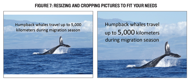
On our way to choose an image for a slide, we pick one without thinking twice about its composition. The photographer took the image a certain way, but that doesn’t mean it should be used as such. Cropping and resizing a picture can sometimes enhance its effectiveness. In Figure 7, the picture on the left that has the whale in the center has been enlarged and cropped to cover the slide. The original picture has been placed in the middle of the slide and does not fill the slide. The result is a background image that provides more visual interest, brings the whale’s subject into focus, and leaves more room in the upper-left corner for text.
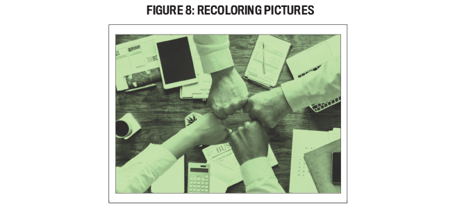
Recoloring pictures in a slide deck can help maintain a consistent aesthetic. By adding a green tint to a full-color picture in Figure 8, PowerPoint’s Colortool matched a color palette. A different way to alter the color vibrancy of a picture is to alter the saturation and tone of the image.
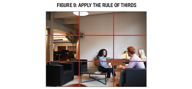
8. The rule of thirds should be applied.
Smith articulated the rule of thirds in 1797, and since then it has been used by artists, photographers, and filmmakers to generate visual interest and compositional energy. According to this rule, the design canvas is divided into thirds on both a horizontal and vertical axis. It is advisable to place important visual elements on or near the intersections of the “third” lines, rather than in the center of the canvas. In Figure 9, the people are not centered within the frame, but are located in the lower-right corner. A dynamic result is achieved because the people are not at the center. You can resize and position your picture on a slide to make it comply with this rule if a picture doesn’t follow this rule. Figure 7 shows two examples of how this trick makes a picture more appealing visually.
You should keep in mind how the text and other elements on top of the image will appear as you adjust it – whether you’re cropping, resizing, or changing the colors. Ideally, the picture should not draw the audience’s attention away from the ideas you’re presenting.
Bonus Tip
To engage Human Beings its important to start with a story, as it helps to get people’s attention and engagement. When engaging them it is important to ask them YES/NO question where you know the probability of answer will be a YES. The more YES you get from the people the more confidence and trust gets build in the conversation.
Try to have at least 4-5 YES answers and then pitch your reshaping or transforming idea which will gets registered in the brain. The aim of the “Yes and No” -approach is to add, carry forward and develop the original suggestion. In a presentation we tend to reject ideas that differ from ours and without even noticing we end up throwing cold water on others in order to satisfy our will to be right. Sometimes we do have a reason for the rejection and sometimes we don’t, but in most cases there would be other ways to handle the situation. By finding something you can first agree on, the situation will get going more easily. It’s alright to use the word “but” as long as you don’t start with it.
Learn by example
Please don’t stop at these 8 tips for creating more visually appealing presentations. You should always seek to improve your communication skills when it comes to presenting information as an accounting or finance professional. Observing what others do is a good way to begin mastering a more visual slide design approach. Save effective slide designs that speak to you for later use when you see them. Creating your own “Pinterest” board of great slide designs is like curating your own Pinterest board.